Five-step guide: Mastering compelling email newsletter design

When shopping for a new device like a laptop or a mobile phone, you have a list of criteria to consider. Beyond functionality, one of the first things you’ll notice is its design.
The same goes for your newsletters. Your email newsletter design is what guides readers towards taking the action that your CTA suggests, like registering for an event or going back to an abandoned cart.
Getting recipients to click on your email subject line is one thing. But if you don’t make your emails memorable, you lower the chances of keeping your brand top of mind for your audience. So, in this article, we’ll walk you through designing attractive email designs that convert readers into long-term customers.
1) Start with an email template builder
With the infinite email design options, building attention-grabbing newsletters gets overwhelming. There’s one way to ensure you follow effective newsletter design practices without spending time creating emails from scratch—that’s putting your trust in a robust email template builder.
These tools are equipped with built-in newsletter templates and a variety of design capabilities to tweak them as you wish. Professional email template builders do the heavy lifting for you, removing the need for design experience.
Here’s what you can get with an email template builder.
Brand consistency
With a solid layout with basic design elements to get started, you can easily customize your newsletters to fit your branding. Adjust the fonts and colors, add your logo, or throw in visual components that match your brand image. With the right software, you can also save your branding assets to access every time you need to create a newsletter – and stay consistent.
Mobile responsiveness
Another crucial consideration of email newsletter design is making your email content accessible on all devices and screen types. With the majority of email opens occurring on mobile, creating responsive emails is non-negotiable. Newsletter software offers ready-made templates with responsive layouts while allowing you to preview how your emails are displayed on different devices and email clients.
High-quality images
Adding high-quality images to your newsletters helps you create more engaging and readable campaigns. Customized images that represent your brand are effective in grabbing attention and building awareness. Most email template builders come with image libraries and drag-and-drop capabilities to easily incorporate them in your layouts and tweak them to your needs.
Clear layout
Clear and uncluttered designs ensure recipients grasp your key points quickly while showing you pay attention to detail. A balanced use of text and visuals is less likely to trigger spam filters, improving deliverability. Ready-made templates give you access to simple and efficient designs that are optimized for readability and engagement.
A prerequisite for clean email layouts is ample white space. The excessive use of different elements could overwhelm readers if there isn’t enough breathing space between them.
Besides giving subscribers a headache, you risk your newsletters not loading properly. Incorporating white space distinguishes email sections, encouraging readers to focus on each component separately without tiring them out.
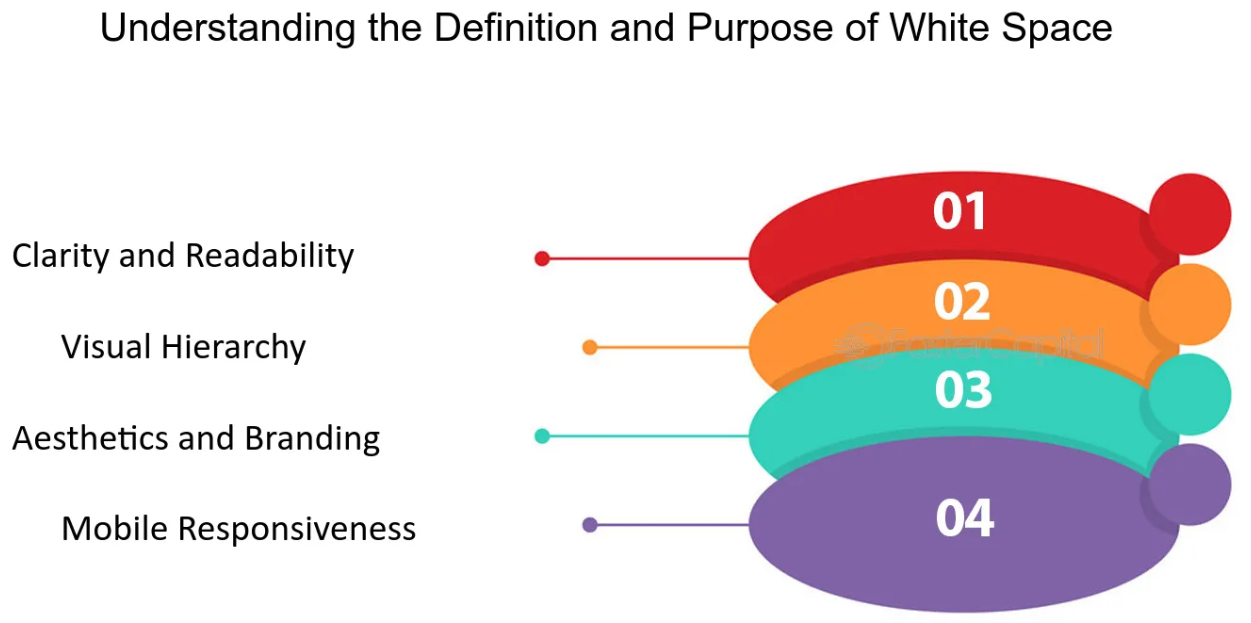
But white space isn’t the only effective method to separate email sections. Use headings and adequate margins to break down your content into digestible parts. Lines or different background colors allow you to distinguish between sections, too. To maintain a clean and organized appearance, it’s important to consider the alignment of elements. Left, centered, or right, ensure consistency to create a well-structured look.
3) Invest in interactivity
People may think that clear layouts equal dull emails. But it’s all about keeping the right balance between different content blocks. Interactive elements allow the reader’s eye to rest and encourage them to explore your email content in a fun way. Interactive content may come in many forms, such as polls or surveys, images, videos, and animations.
Interactive components transform the user experience and effectively convey your message. Here are some examples on how to boost engagement through the power of interactivity:
- In the case of surveys and polls, you can optimize list segmentation and personalization through valuable audience insights.
- Informative videos are an ideal option for showing new services in action. You could also use behind-the-scenes videos to present your company culture.
- Adding image carousels allows marketers to introduce new products without tiring users with lengthy descriptions.
- If your brand tone is playful, you could include GIFs or memes to add some personality to your newsletters and emphasize key points.
Keep in mind that you shouldn’t go over the top with interactive elements, though. Using GIFs or emojis just for fun will do more harm than good. That’s why you should add interactivity where it serves your overall message. And since this type of content is meant to visually enhance your story, choose the right blocks wisely to reflect your unique brand identity.
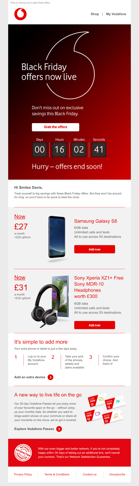
Let’s consider this email by Vodafone, which uses a countdown timer to remind subscribers about their exclusive Black Friday offers and drive more conversions. Countdown timers are effective for time-based campaigns, creating a sense of urgency that can influence buying decisions, especially when combined with actionable wording:
4) Pay attention to fonts and colors
Unfortunately, not all fonts are easy to read or render well on smaller screens—and this may include your brand fonts. While some may look good on a logo, they might not work for an entire newsletter. That’s why you must find out which fonts are safe and legible and consider using mixed typography to include your brand fonts in specific newsletter sections.
Proper typography goes hand in hand with picking the right font size. It’s crucial to remember that most of your subscribers check your emails on their mobile devices. So, the font size of your email body should be large enough for users with small screens. Avoid anything smaller than 16 px for email body and 20-24 px for headers.
Another important factor for improving the reading experience is your choice of color schemes. Mind your color palette by avoiding risky combinations—for instance, mixing colors that blend. Instead, use complementary colors to add proper contrast and make key details stand out.
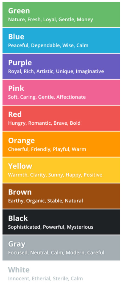
Also, incorporate your brand colors for readers to recognize your emails. Just ensure you don’t overdo it and that they match the overall newsletter design. Last but not least, do some research on color psychology. Different colors convey different emotions, so try to keep this in mind when deciding on the color combination in your emails:
5) Keep the communication lines open
Your email newsletter design goes beyond visuals, typography, and colors. It should be about connecting with your audience at a deeper level. Many brands stick to the basics, missing hidden opportunities to boost engagement. Here’s how to benefit from your newsletter to further promote your brand.
Work on your email signature
You could turn your email footer into a memorable piece of content that readers relate to your brand. Fill this space with the communication channels provided to contact you or your customer service team. Add your legal disclaimers, unsubscribe options, and return policies to your email signature to promote transparency and show that you respect your audience’s choices and rights.
Complement your main CTA
Your call to action directs users to a specific action that represents your email objective. But there can be more to your content if you invest in giving more options for non-converters.
For example, you may want recipients to download an eBook or other type of downloadable resource. Consider offering a brief preview for readers who aren’t ready to commit to get a glimpse. Or, instead of focusing solely on downloads, invite them to a related webinar that allows for direct interaction.
Add social media buttons
By incorporating your social media buttons into your newsletter design, you get an additional chance to continue the conversation beyond email. Usually, social media buttons work great in your email footer. Connecting with your audience across multiple channels allows recipients to see more of your valuable content and the exciting things your brand is up to.
Standing out with remarkable email newsletter design
We’ve listed the most effective ways to elevate your email newsletter design. Still, there’s always room for your own creative approach to experiment with different marketing ideas and innovative tactics. After all, newsletter design is more about showing your brand personality instead of blindly following trends.
What you shouldn’t forget is tracking your subscribers’ engagement and monitoring key email marketing metrics. Make a routine out of noting what worked as expected and what you should rethink. That way, you’ll have a set of successful methods and elements at your fingertips to build compelling newsletters every single time.
Maria Fintanidou works as a copywriter for email marketing automation software Moosend, having created the Help Articles (FAQs) and overseen the platform’s translations in Greek and Spanish. She loves exploring new cultures and ways of thinking through traveling, reading, and language learning.