The ultimate guide to colour psychology in marketing
We’re surrounded by colour every day. But have you ever stopped to think about what individual colours mean – or how they make you feel or act?
Colour and its psychological effects play an important role in branding and marketing. Customers knowingly (or, more often, unconsciously) make decisions about whether they like a brand or not based on the colours used by the brand.
In this article, we will explain why a good understanding of colour psychology is essential, and what individual colours mean, so you can make the best choices for your brand.
Why are colours vital to branding?
Colours are incredibly significant when it comes to marketing and branding design. Colours can impact how we think and feel about brands and their marketing, how we look at things, our perspectives, and the opinions and decisions we make after observation.
Brands today are competing for customers in an increasingly crowded – and competitive – marketplace. And the time and attention they are granted in decision making is greatly reduced.
Indeed, studies show that customers judge a product within 90 seconds of interaction with it, and about 62%-90% of that judgment is based on colour.
So, as you can imagine, a good knowledge of the importance of colour in decision making can make all the difference and help your brand stand out of the crowd.
Colours and their interpretations
But before you randomly pick a colour simply because you like it, it’s important to understand how people react to colours – and what they can mean. Tools like coloring sheets, which rely heavily on intentional colour selection, also demonstrate how different shades can influence emotions and interpretations.
While, to an extent, colour interpretation varies widely from person to person depending on their personal experiences, there are some universal assumptions about colours and their meanings that can help brands to choose the right tones for their logo and marketing.
Colour theory attributes particular characteristics to individual colours, and is used by designers to ensure marketing and branding creates the right impression.
Just look at how many financial institutions use dark shades of blue to convey reassurance, trust and longevity. Or how many fast food outlets and cartoon networks use bright, fun, young shades of energetic red and orange.
This research found that blue is used in over 75% of credit card brand logos but just 20% of fast food brand logos. And red is used in over 60% of retail brands, but 0% of apparel logos.
Here’s a handy visual chart showing well known logos groups into their colours by Canva:
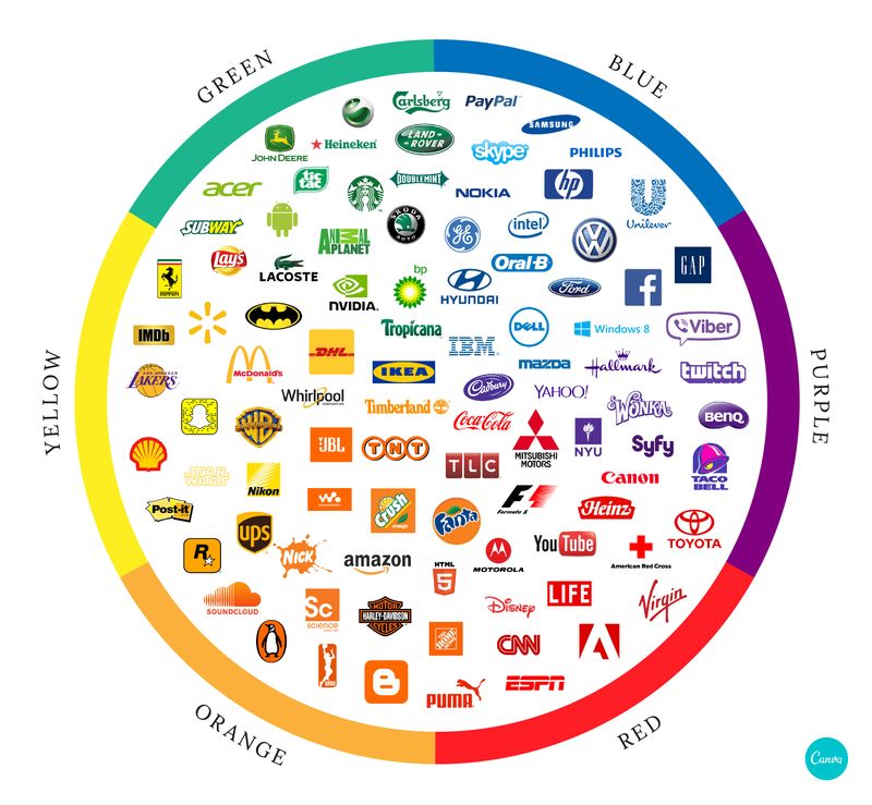
So, if you want to choose a colour for your logo and marketing, which one would best suit your brand? To help you, here are the main colours, and what they mean as a generalisation.
Black means mystery, strength and refinement
Black is a colour often linked with seriousness and mystery, refinement and strength, but it’s darker side can be associated with depression, loneliness, sadness, and even death.
Black is used extensively in the high-fashion industry. It also works very well in scenarios where high contrast is needed.
Blue means stability, calmness and confidence
Blue is an incredibly popular choice of brand colour. Emitting calmness and trustworthiness, brands tend to opt for shades of blue if they want to be seen as reliable and trustworthy.
Brown means earthy, comfort and security
The colour brown is related to natural elements, such wood, earth, sand etc. Green is also associated with nature, but has stronger bonds with life and liveliness.
Brown is more grounded, literally and figuratively, as it’s seen in nature in roots of plants and heavy trunks of trees. This association gives it emotions of balance, firmness, and support.
Green means growth, health and envy
Green is commonly associated with nature, life, and growth. In nature, green is most widely present in the leaves of trees and plants, binding it strongly together with life, liveliness, and vibrancy.
If your brand or product is somewhat related to nature conservation or eco-balance, you might want to incorporate some green in it.
Orange means imagination, adventure and excitement
Orange commonly represents excitement and energy, as well as sympathy and friendliness. Studies have shown that the colour orange can boost a sense of activity and stimulate brain neurons.
Maybe that’s why it’s easy to understand now why three of the five business books on my bookshelf right now heavily feature the colour orange.
Purple means nobility, spirituality and wisdom
Purple is a majestic colour, but also has roots in imagination and wisdom. A blend of red in blue, it shares equal characteristics of both, with the power and passion of red, and the calmness and trust of blue.
It’s particularly easy to spot its association with royalty and its use in sports.
Red means excitement, passion and danger
Red is strongly associated with excitement and energy. In short, red is a colour that is easy to spot and easily stands out. Traffic lights have the colour red to indicate STOP because it is easily visible from a distance.
Red can be powerful when employed on things like buttons, or warning boards – anything that demands attention and caution. Depending on the context used, red can also portray aggression and anger. So use it wisely.
Yellow means happiness, positivity and warmth
Yellow, the colour associated with the mighty ball of fire – the Sun, is the epitome of happiness, positivity, and warmth.
Used in the right balance, yellow oozes joy, happiness, and confidence. Too much, though, can make people hypercritical and anxious.
What colours will you use for your marketing?
We hope this introduction to the psychology of colour helps you when choosing colours for your logo and brand colour palette, and gives you some inspiration.
Iman Shakeel is a Content Writer at Designfier, a graphic design marketplace that can help you to choose the best colour for your branding and marketing.
Photo by Alex Jackman

