How to match wallpaper with furniture style and lighting

Wallpaper can look lovely online and awkward at home. The photo has perfect light, one neat chair, and no old rug or yellow-toned floor getting in the way. In a real room, the print has to sit beside what is already there.
That is where matching wallpaper with furniture begins. Look at the sofa, bed, table, wood finish, curtains, and lamps before choosing the wall. Homeowners and renters planning a refresh can use https://wallhue.com/ to compare colors, pattern sizes, and styles before ordering samples.
Why Wallpaper, Furniture, and Lighting Need to Work Together
Wallpaper is never seen alone. It sits behind a sofa arm, next to a headboard, near a lamp, or partly covered by shelves. Those nearby pieces change the whole read of the wall.
A faded floral may feel easy behind a plain linen couch. Put it beside dark carved furniture and a patterned rug, and it can suddenly look fussy. A quiet texture may feel dull under one ceiling bulb, then better near a warm table lamp.
Light is the usual surprise. Beige turns yellow. Gray leans blue. Green looks fresh at noon and heavier after dinner. Tape the sample where it will actually go.
Matching Wallpaper to Furniture Style
Furniture gives a room its weight. Wallpaper changes the air around it. The two do not have to match, but wallpaper and furniture style should not feel chosen from separate rooms.
Pairing Wallpaper With Modern and Minimalist Furniture

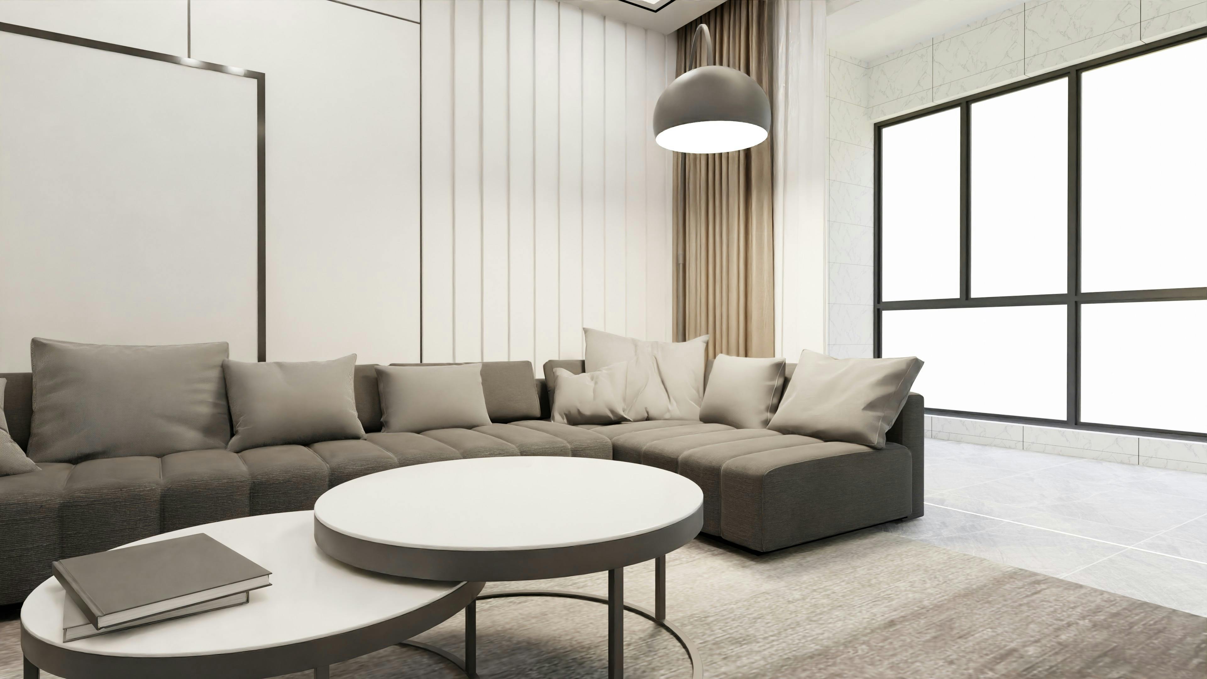
Wallpaper for modern furniture often works best when it adds texture, not clutter. Clean sofas, low beds, slim chairs, and flat cabinets leave space for plaster effects, loose line drawings, soft geometrics, or large organic prints.
A white sofa against a flat white wall can feel unfinished. A cream textured paper behind it gives the room a little depth.
Pairing Wallpaper With Classic and Traditional Furniture

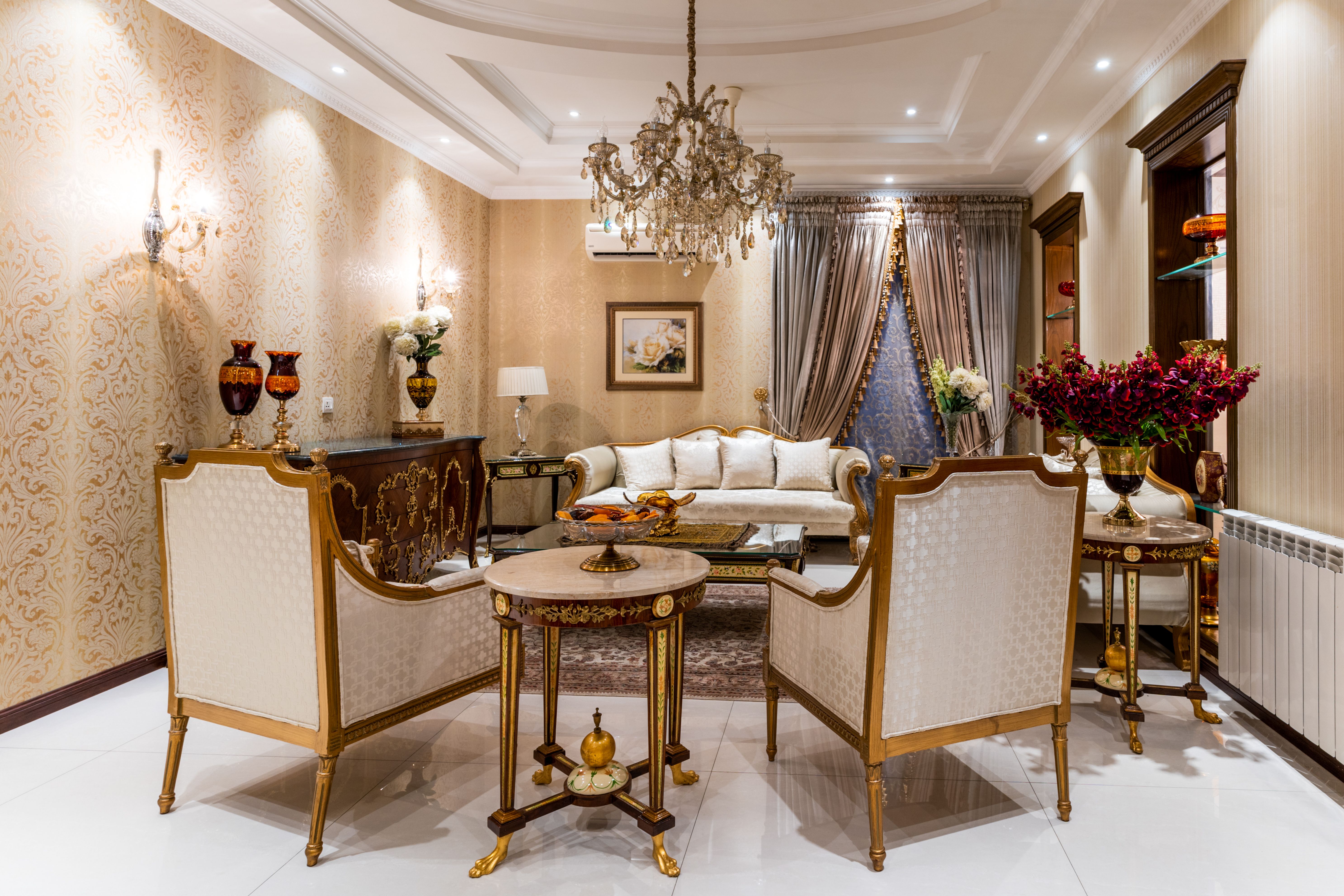
Wallpaper for traditional interiors can take more detail. Curved chairs, tufted upholstery, carved wood, and antique cabinets usually sit well with faded florals, vines, soft stripes, or damask-style patterns.
Still, heavy furniture needs air. If the bed, dresser, or dining set is dark, a lighter background usually feels better than another dense print.
Pairing Wallpaper With Rustic and Natural Wood Furniture

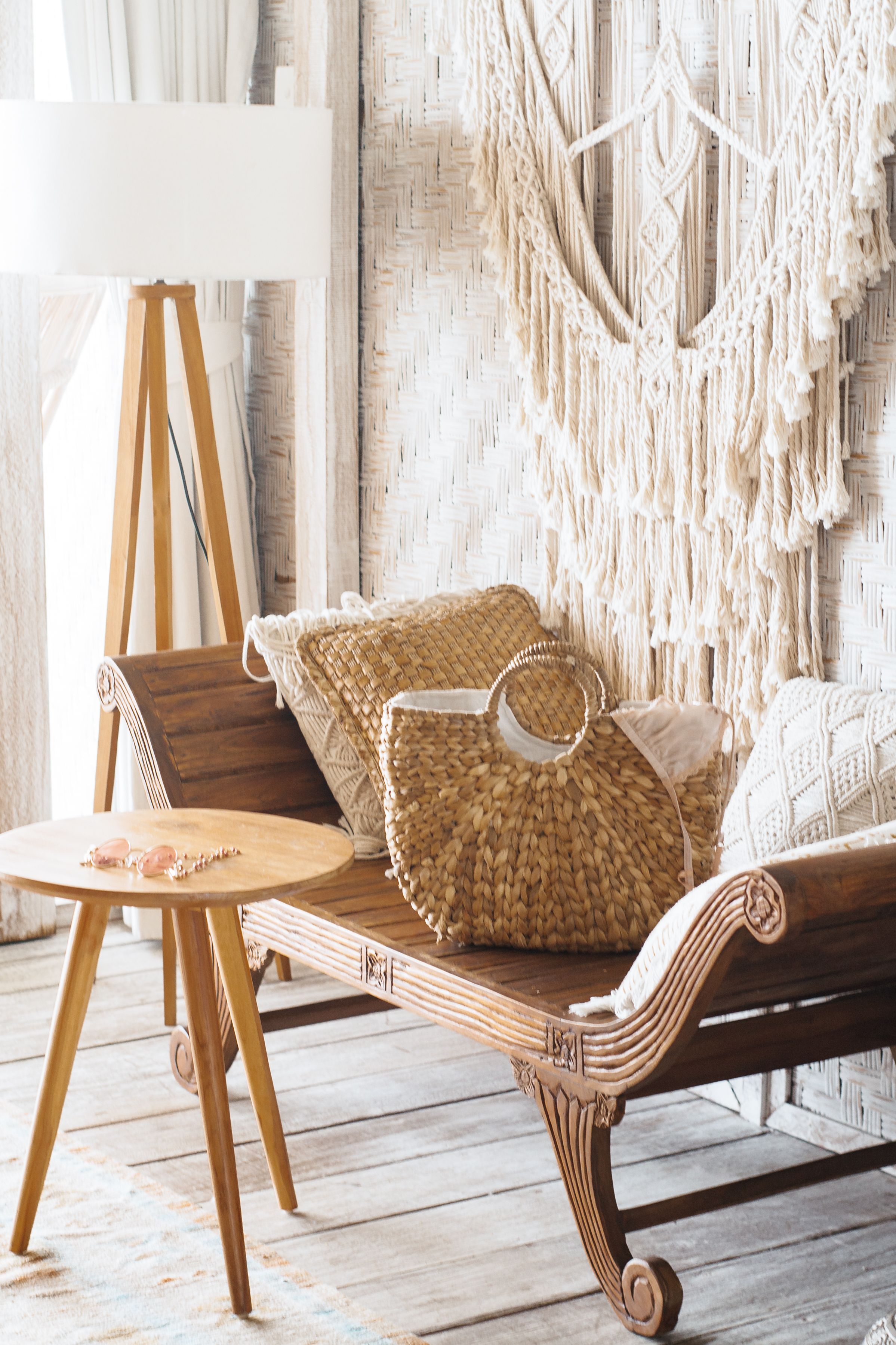
Wallpaper to match wood furniture depends on the tone. Pine and oak often work with cream, clay, olive, muted gold, or soft brown. Walnut and cooler stains may sit better with stone, chalk white, dusty green, or gray-blue.
Rustic rooms already have grain and texture. Washed botanicals, grasscloth effects, leafy prints, and quiet landscapes feel easier than sharp graphic patterns.
Pairing Wallpaper With Bold or Statement Furniture Pieces

A bright sofa, painted cabinet, patterned chair, or dramatic headboard already leads the room. The wallpaper does not need to fight it.
Try a textured neutral, a tone-on-tone print, or a simple pattern that repeats one color from the furniture. A rust sofa may only need a small clay detail in the wallpaper.
Choosing Wallpaper Colors Based on Existing Furniture
Most rooms are not blank. The sofa stays. The table stays. The floor color is not changing. When thinking about how to match wallpaper, start with the largest thing in the room.
Check:
- sofa or sectional
- bed, headboard, or dresser
- dining table and chair finish
- strongest wood tone
- rug or curtains that will stay
Do not chase an exact match. A wallpaper that is almost the same blue as the sofa, but slightly off, often looks worse than clear contrast. With mixed furniture, choose a print that repeats two or three quiet colors from the room.
How Natural Light Affects Wallpaper Choice
Natural light changes the wall before lamps are on. North-facing rooms can make gray, blue, and green feel colder, so cream, clay, warm beige, or muted peach may be easier. Very sunny rooms can push warm wallpaper too far, especially with honey floors or tan leather.
Window placement matters too. A wall beside the window shows more texture and shadow. A wall across from the window may look brighter but flatter. Test the sample on the exact wall.
How Artificial Lighting Changes Wallpaper Appearance
Artificial light is where safe choices sometimes fail. Warm bulbs pull out yellow, red, brown, and cream. Cool bulbs sharpen gray, blue, and green.
One overhead light can flatten a room. Lamps are kinder. A shaded table lamp, floor lamp, or wall sconce can make texture and pattern look softer at night, especially with grasscloth effects, metallic details, dark colors, or raised prints.
Matching Pattern Scale to Room Size and Furniture
Large prints need space. They work best on open walls, behind low furniture, or in rooms where shelves and frames will not cut the design into pieces.
Small patterns are easier in compact rooms, hallways, powder rooms, and busy layouts. If the furniture is carved, colorful, or already detailed, keep the wallpaper quieter. If the furniture is plain, the wall can do more.
Mistakes to Avoid When Matching Wallpaper, Furniture, and Lighting
The common mistakes are boring, but they cause the biggest regret:
- choosing from a screen only
- testing a sample once and calling it done
- mixing strong wallpaper, rug, curtains, and upholstery
- ignoring glossy, dark, or glass furniture
- almost matching a sofa color
- hiding a mural behind tall furniture
Put the sample near the sofa, bed, cabinet, or table. Check it with curtains open, curtains closed, lamps on, and overhead lights on. Annoying, but useful.
Conclusion
Good wallpaper does not have to match every chair, lamp, and fabric. It just needs to feel like it belongs there. The color should sit well beside the furniture, the pattern needs enough room, and the lighting should not turn the wall into something else at night.
When those pieces line up, the room feels calmer. Not staged, not overly designed, just settled.